SALE DI BALENA
I designed the packaging for Sale di Balena, a 100% Italian sea salt brand, with a focus on purity and authenticity. The ocean-inspired gradient, clean typography, and minimalist design highlight the product’s natural origins while ensuring a modern, premium, and eye-catching shelf presence.
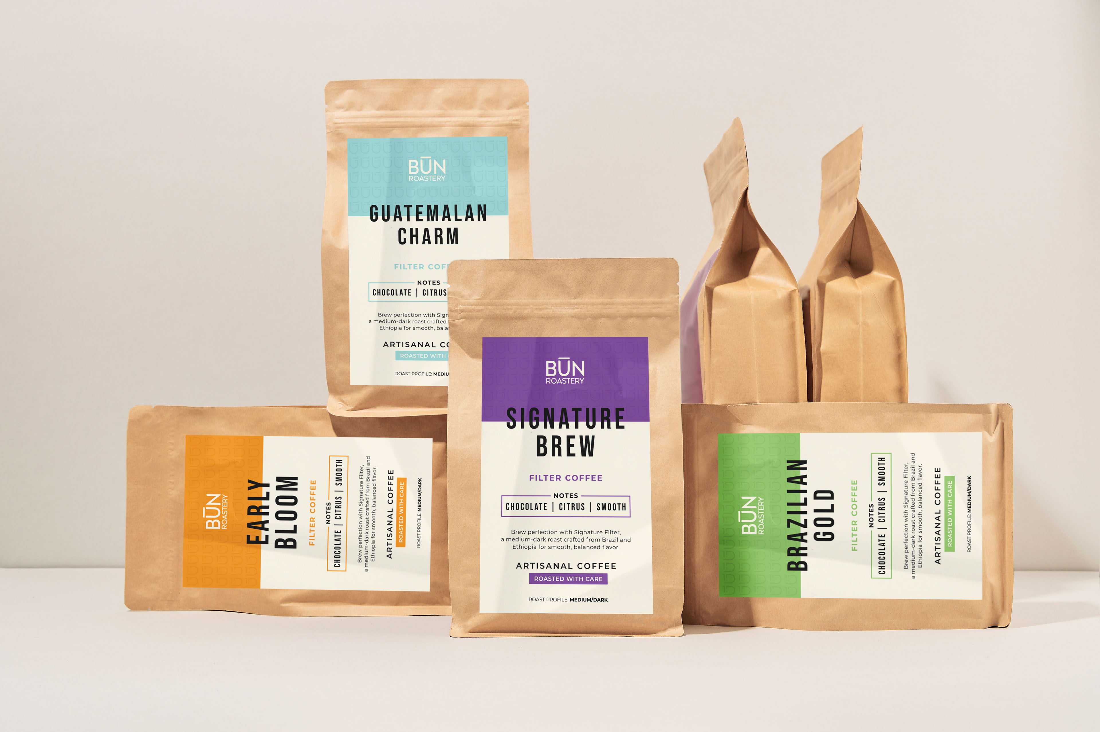
BUN ROASTERY
I designed the packaging labels for BUN Roastery, a sub-brand of Bun Fellows, a well-known coffee house in Jordan. The design balances modern simplicity with artisanal charm, using a clean layout and a color-coded system to differentiate blends. The bold typography and minimal aesthetic ensure clarity and premium appeal, reinforcing BUN Roastery’s dedication to high-quality, carefully roasted coffee.


KTCHN
KTCHN, a sub-brand of Bun Fellows, brings a wholesome twist to snacking with high-protein bars, cookies, and date balls. The label designs reflect the brand’s commitment to clean, nutritious ingredients, combining a bold yet minimal aesthetic that enhances shelf appeal. Each product’s key benefits—such as protein content and refined sugar-free recipes—are clearly highlighted, ensuring an engaging and informative experience for health-conscious consumers.
I created two distinct design options to capture KTCHN’s identity, balancing bold energy with an inviting, health-conscious appeal. The final designs seamlessly blend clarity, functionality, and modern aesthetics, making KTCHN products stand out both visually and nutritionally.